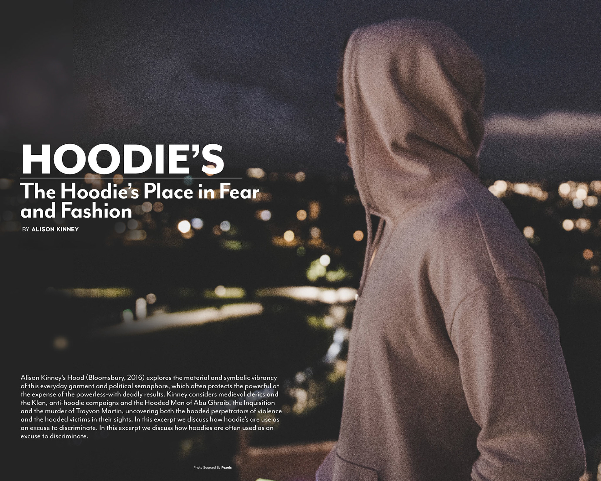
Overview
During my studies at Vancouver Island University I was assigned to work with an art director to create mock article spreads for a magazine of my professors choosing, in my case it was Folklife magazine.
Rational
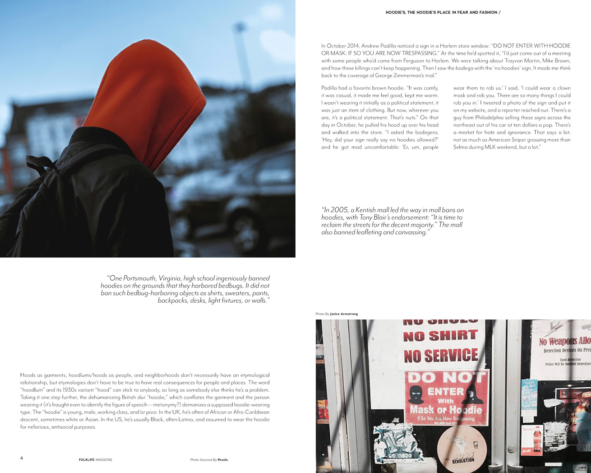
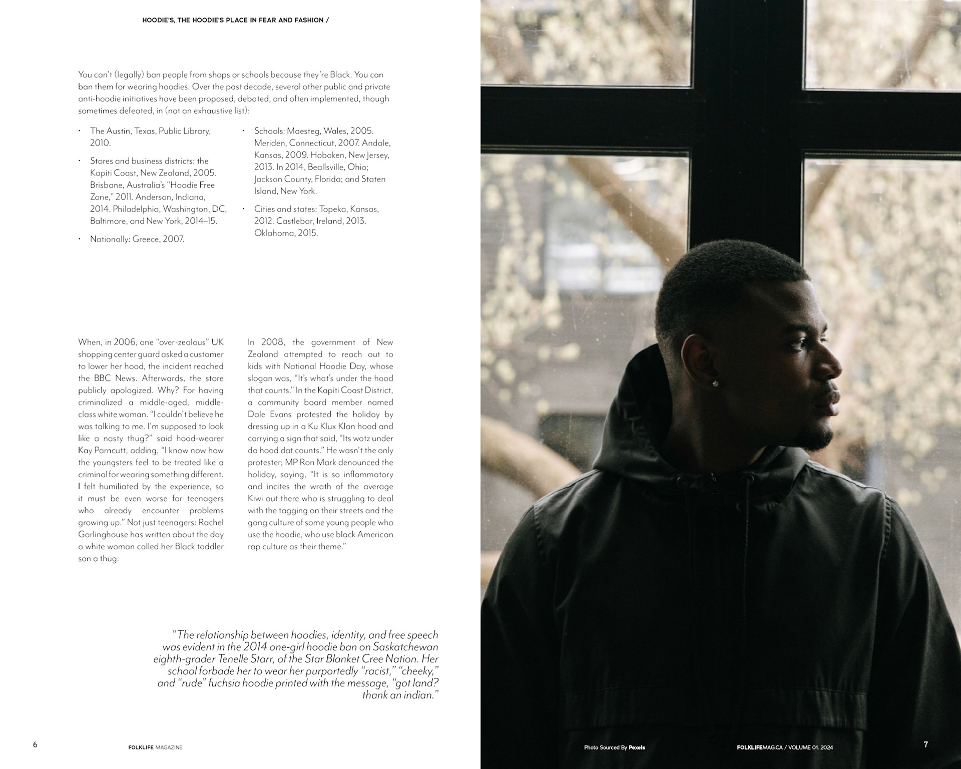
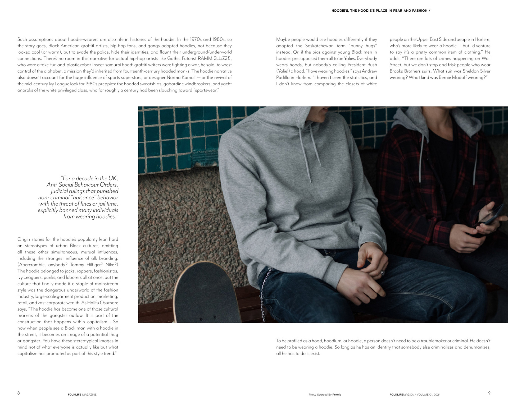
With direction from my art director we were able to identify the characteristics of the Folklife magazine spreads. I chose more gritty natural photography for my spreads to capture Folklife's feel and vibe while also conveying the topic of the article. The layout of the text was set to mimic to layout of the text in Folklife's spreads, organic yet structured.
Process
The process to craft these spreads had many critique sessions to assure we achieved Folklife's feel and over all look. After being briefed by my art director I first started this projects by creating the layout for the text and the future images. After the critique I refined the layout then started searching for the imagery to place into the spreads. With more feedback from my art director we were able to find the perfect imagery as well as the perfect layout for the spreads.