Overview
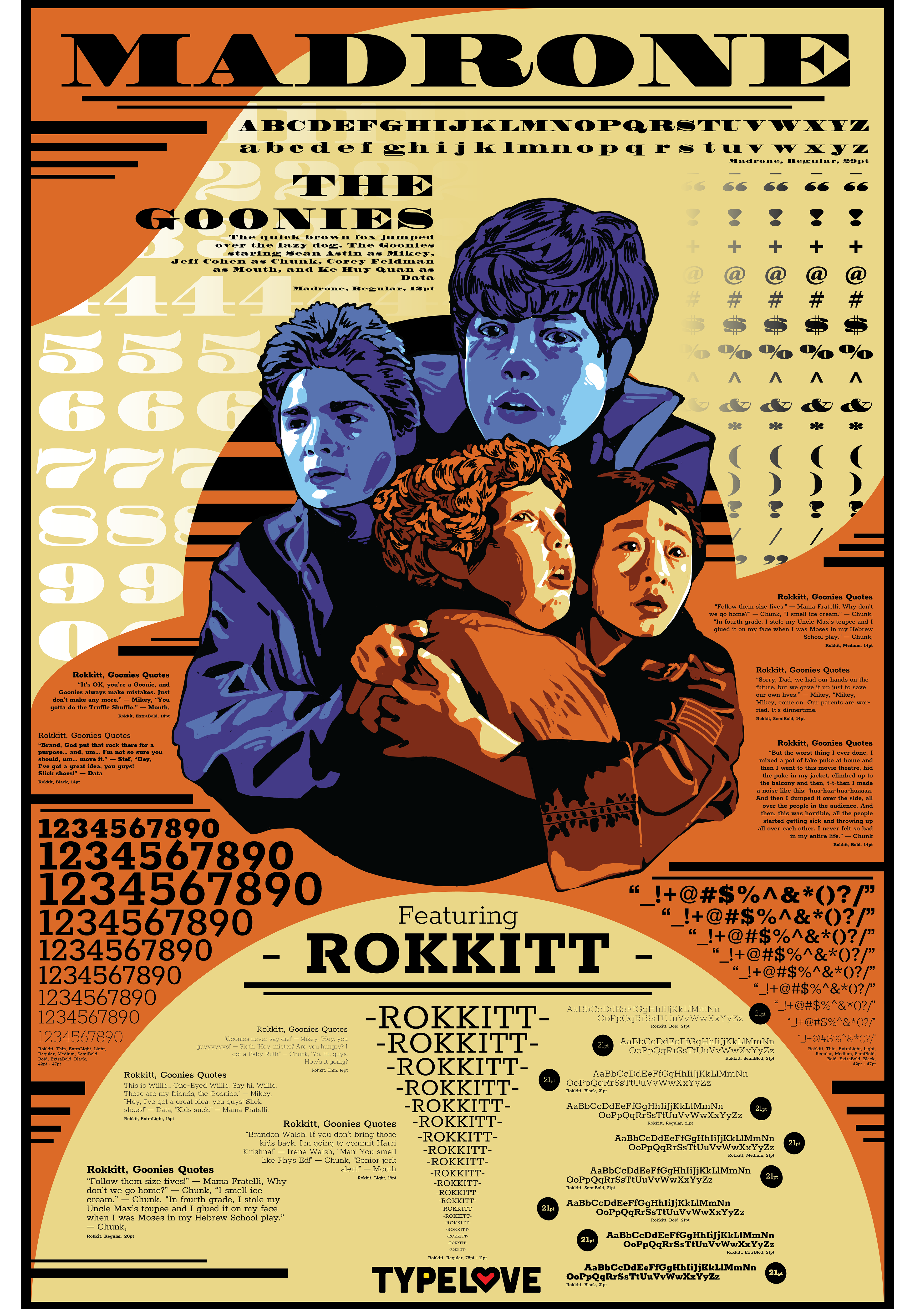
During my studies at Vancouver Island University I was assigned to create a 24 x 36 inch type specimen poster that highlights two different complementary typefaces. In addition to this I was assigned an art director who gave me the design theme of 80s movies poster.
Rational
When picking an 80s movie to model my poster after I wanted to pick a movie that would be fun and mean a lot to me, so I picked "The Goonies". "The Goonies" was a big part of my childhood, being one of my favourite movies growing up. My family and I watched it so much that we would quote the movie on a daily bases.
I chose the typeface "Madrone" and "Rokkitt". I chose these two typeface because I feel like it fit the theme of the movie I had chosen. "The Goonies" is about finding lost pirate treasure, so to refer back to that I wanted to chose typefaces that had the vibe and feel of an old timey pirate map or type writer.
For the colour palette, I wanted to replicate the colour palettes of past 80's movie posters. A monochrome look, with high contrast between the highlights and the shadows.
Process
After being briefed by my art director I went to search for an 80's movie to model my poster after. I chose "The Goonies", a childhood favourite. I brainstormed ideas for sort of centre peace that highlighted the movie while not overshadowing the purpose of the poster, which is to highlight the complementary typefaces. It went form illustrating the pirate ship from the movie to illustrating the main four characters of "The Goonies". Once I was done with the illustration I then placed the text.